Français |
 to start this function.
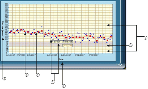
| Item | What it means |
| 1. Date | X-axis reflects the unit you chose from “Grouping Unit”, including date, time, day and measurement interval. |
| 2. Glucose (mmol/L) | Y-axis shows the glucose unit you chose from “Software setting”. |
| 3. Data point | The red dot “ ” stands for the individual glucose readings. ” stands for the individual glucose readings. |
| 4. Data average point | The blue square “ ” stands for the average of individual glucose readings in each column. ” stands for the average of individual glucose readings in each column. |
| 5. Data information | Point to the dot and data information displays. The data information will display two boxes, one box for date and time, another for the blood glucose value. |
| 6. Target range area | Gray area reflects the glucose level you set in “Personal setting”. |
| 7. Out of target area | Appears in light yellow color. It reflects the range beyond target you set. |
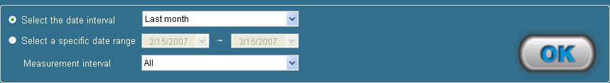
 button and your data will be presented at the interval you selected. button to confirm. The data will be presented at the specific interval you selected.